Designing Complex Pages in Business Central
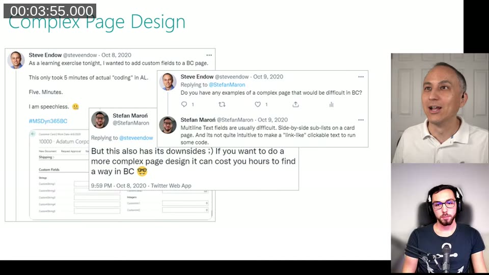
Back in October 2020 I replied to a tweet from Steve Endow about how quickly you can add custom fields to a BC page — “This only took 5 minutes of actual coding in AL. Five. Minutes.” — and I added something along the lines of: yes, but if you want a more complex page design, it can cost you hours to find a way in BC.
A year later Steve remembered that tweet and pulled me into a live chat to actually discuss it. You can watch the full recording on Steve’s YouTube channel if you want the full conversation. The context for the discussion was Steve’s BC data generator project — he was rebuilding a .NET internal tool in BC and hit the exact problem I had mentioned.
The Problem: Leaving .NET Behind
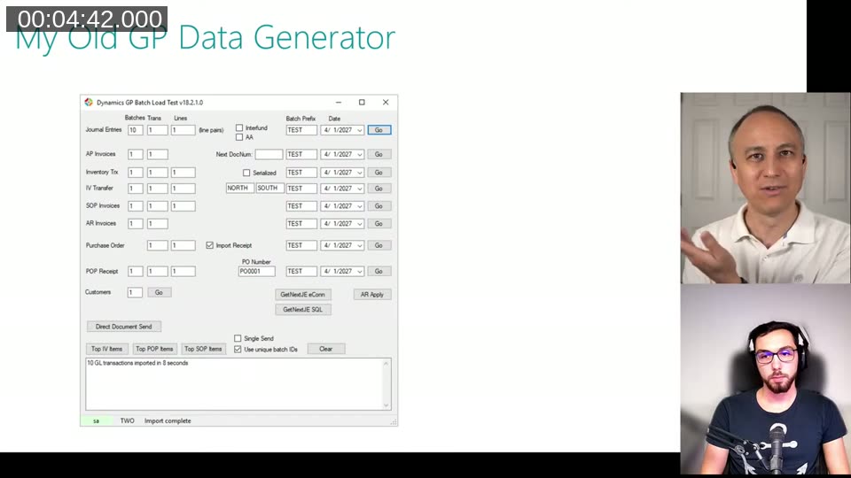
Steve’s old tool was a Dynamics GP data generator built in .NET. It had multiple buttons doing independent things, input fields laid out in a grid, a status bar updating as long-running imports progressed, and a log box showing results. Typical WinForms — you place controls wherever you want, pixel by pixel.
Trying to replicate that kind of layout in BC is where things get interesting. The RTC (Role Tailored Client) replaced the classic NAV client around NAV 2009, and with it went pixel-perfect form layout. Since then, pages follow a structured flow — groups, fast tabs, fields — and BC controls how things resize and reflow on different screen sizes, tablets, phones.
That constraint is actually a feature once you accept it. BC handles responsive layout, high-DPI rendering, mobile apps. Your .NET form almost certainly doesn’t look right on a HiDPI screen. The tradeoff is that you can’t just slap five independent “Go” buttons wherever you want.
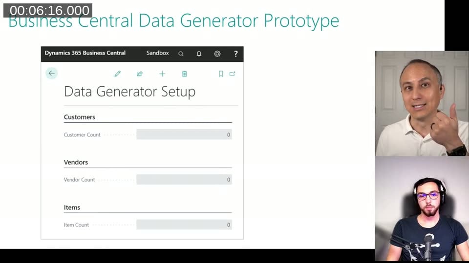
What Steve’s Prototype Looked Like
His first BC prototype was a setup page with a few fast tabs — Customers, Vendors, Items — each with a count field. The question was: how do you let the user trigger data generation per section, or for all sections at once?
Options discussed:
- A single “Create Data” action in the action bar — but that applies to everything, so you’d need separate per-section actions, which gets cluttered fast
- A list page with “Select More” + actions — workable but not exactly intuitive for a setup-style page
Clickable Text: The Button Hack
The approach that came up — and that I mentioned in my original 2020 tweet — is using a field with a static text value and a DrillDown trigger. No table behind it, no variable even. Just a text constant as the field value, ShowCaption = false, and code in OnDrillDown. The user clicks the text and code runs.
It looks like a hyperlink on the page. It’s not a button, and it will never look like one, but for internal tooling or wizard pages it works fine. Jeremy in the chat pointed out it’s used in wizard pages in the base app too.
📖 Docs: The OnDrillDown (Page Field) trigger is what you put the code in. Set
DrillDown = trueon the field and the trigger fires on click.
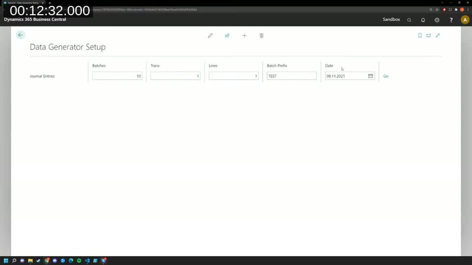
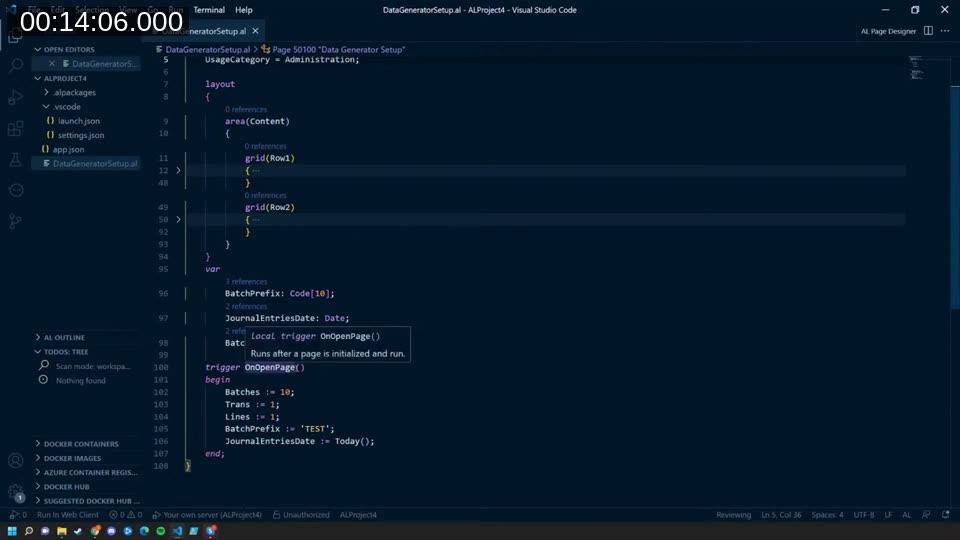
The Grid Layout Option
I also put together a quick demo — I had maybe 10 minutes to prepare — using a grid layout. Instead of the usual groups and fast tabs, a grid creates actual rows and columns on the page.
The AL code looks like this in structure:
layout
{
    area(Content)
    {
        grid(Row1)
        {
            // fields for row 1
        }
        grid(Row2)
        {
            // fields for row 2
        }
    }
}
A few things to know about grid layouts:
- Every row needs the same number of columns — you have to add empty fields to pad rows that have fewer items
- All captions need to be set manually with
ShowCaption = falseon every field, otherwise alignment breaks - They don’t resize and reflow the way normal fields do — if the user resizes the browser window it can get weird
- They were broken or very buggy in the web client until around BC 17 and are still rare in the base app
📖 Docs: The official Arrange Fields Using Grid Control docs cover the syntax and the
GridLayoutproperty options.
My honest recommendation: don’t use grid layouts for customer-facing pages. They’re a lot of maintenance for something that should just use groups. The standard group layout handles resizing, accessibility, mobile, and all the other things you get for free by working with BC rather than fighting it.
For an internal-only dev tool where you control the screen size? Maybe. But even then I’d think twice.
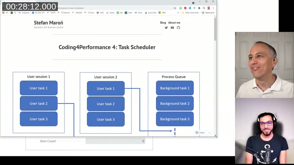
Running Operations in the Background
One other topic that came up: Steve’s .NET tool shows live progress as it imports batches of records. How do you replicate that in BC?
The short answer is: you don’t, really — not in the same way. If you run code directly in a trigger, the UI thread blocks until it’s done. The user just sees a spinner.
The proper BC approach is to offload the work. There are a few mechanisms:
- Job Queue — the classic one, user-schedulable recurring tasks
- StartSession — run a codeunit as a background session, relieving the UI thread. The downside is it still runs on the same server instance, so if you’re on a single-instance setup you haven’t really separated the load
- TaskScheduler — more flexible than StartSession. You call
CreateTask, it writes to a queue table, and a background session picks it up on whichever server instance handles background work. You can enable or disable the task scheduler per server instance
I had written a whole blog series about this back in 2020 — “Coding4Performance” — covering background tasks, StartSession, and the task scheduler in detail. Steve pulled it up live during the chat.
📖 Docs: The BC Task Scheduler API is documented on learn.microsoft.com and covers
CreateTask,CancelTask, and related methods.
In SaaS, Microsoft dynamically manages server instances behind a load balancer, so dedicated background-only instances aren’t an option the way they are on-premises. Background sessions are still load-balanced across whatever instances are running. The maximum is 100 concurrent background sessions, and there’s a queue beyond that.
The Takeaway
The main thing I’d say about complex page design in BC: don’t start from what your old .NET form looked like. It will never be a direct translation, and trying to force it will make you miserable.
Work with what BC gives you — groups, fast tabs, clickable text for simple triggers, job queue or TaskScheduler for anything long-running. The result won’t look the same but your users will benefit from a consistent UI that works on every screen size, including phones and tablets, without you having to think about it.
This post was drafted by Claude Code from the stream transcript and video frames. The full stream is on YouTube if you want the unfiltered version. (I did read and check the output before posting, obviously 😄)